Landing Page Message Match: How to Align the Ad, the Offer, and the Form to Raise Qualified Conversions
Author: Richa Naik, Digital Marketing Manager
Date : 2 November 2026
A person clicks an ad promising a free quote for kitchen installation. The page they reach opens with a company slogan and a stock photo. They hesitate, wonder if they are in the right place, and leave. Nothing was wrong with the targeting or the offer. The page simply did not continue the conversation the ad began.
This is a message match problem, and it is one of the most common causes of poor lead conversion. This article explains what message match is, how to audit it, and how to design the form so that the people who do convert are the people you want. For a broader view of improving pages after the traffic arrives, our guide to landing page optimization is a useful companion. Here we focus on the link between ad, page, and form.
What Message Match Means
Message match is the degree to which a page confirms what the ad, search query, or link led the visitor to expect. It has three layers.
- Verbal: the headline and first lines use the language the visitor already saw or searched.
- Visual: images, colors, and layout feel like a continuation of the ad and the brand.
- Intent: the page offers the action the ad promised, not a different one.
A visitor decides within seconds whether they are in the right place. A page that confirms it quickly earns time to read. A page that makes them work it out loses them.
Start With the Query or Ad, Not the Page
Write down what the visitor believed when they clicked. For search traffic, that is the query and the ad text. For social traffic, it is the image, the opening line, and the offer. Then compare these with the first screen of the page.
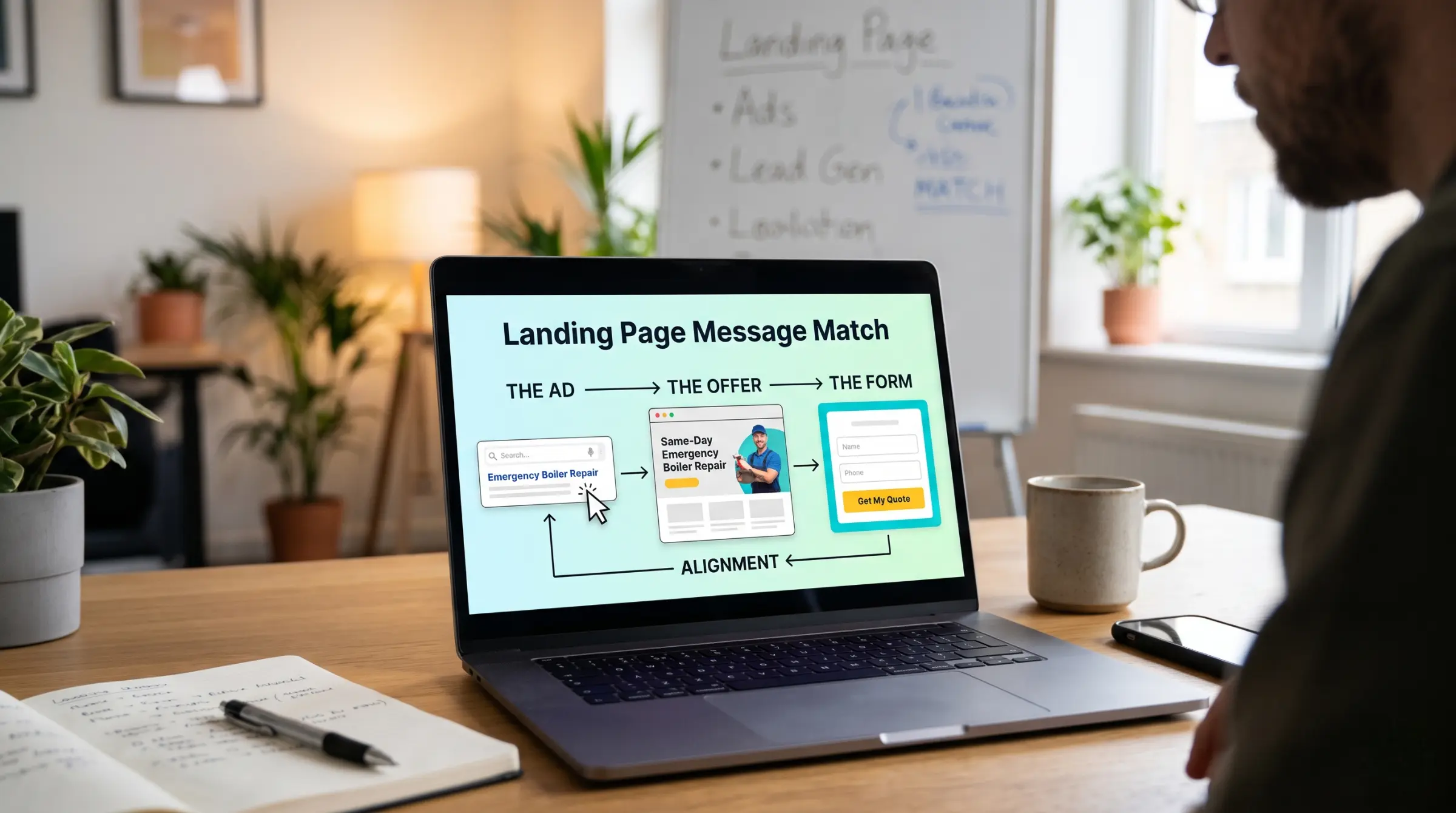
Illustrative example. A search ad reads "Emergency boiler repair, same-day visits". The page headline says "Heating and plumbing solutions for every home". The page is accurate but generic. A visitor in a hurry may not see their need reflected. Changing the headline to "Same-day emergency boiler repair" and adding the service area below it connects the two. The offer and the business have not changed. Only the match has.
Audit the Page in Five Checks
Use these checks on every lead page, and on every distinct ad group or audience feeding it.
- Headline: does it name the offer or problem in the visitor's words?
- First screen: without scrolling, can the visitor see what is offered, who it is for, and what to do next?
- Offer consistency: are price, terms, and conditions in the ad identical to the page? Differences create distrust.
- Visual continuity: do the image and style resemble the ad and the brand?
- Call to action: does the button wording describe what happens next, such as "Get my quote", and does it match the ad?
Score each check as pass, partial, or fail, and note the fix. Work on failed checks first.
One Page per Intent, Within Reason
A single generic page for all campaigns almost always weakens message match. Different intents deserve different pages, or at least different headline and proof sections. You do not need a hundred pages. Group your campaigns into a handful of intent clusters, such as emergency service, planned projects, price comparison, and brand searches, and give each cluster a tailored page.
Dynamic text replacement, which swaps parts of the page according to the query, can help at scale. Use it carefully, because mechanically inserted phrases can read awkwardly and sometimes misstate the offer. Review samples before launching.
Design the Form as a Filter
The form is where message match meets qualification. Each field has a cost in completions and a benefit in lead quality.
- Ask for the minimum needed to act, and add questions only when they improve qualification. A question about budget band or timeline can discourage people who were never going to buy, and help sales prioritize.
- Use clear labels and the right input types. A phone field that accepts only digits reduces errors.
- Place consent wording and the privacy notice link near the button, in plain language. See our overview of consent and disclosure basics for what to include.
- Show what happens after submission, such as "We reply within one working day".
- Confirm on screen that the form worked, and send the visitor to a thank-you step that also invites the next action.
Do not guess whether a shorter form is better. Test it, and measure the effect on qualified leads, not only on completions. A shorter form often raises submissions and lowers the accepted share. A longer one may do the opposite. The right answer depends on your offer and your sales capacity.
Build Trust Without Inventing It
Visitors who do not know you look for reasons to trust the page. Useful elements include a clear business name and contact details, real customer reviews displayed from a source you can show, accurate credentials or accreditations, a short explanation of the process, and plain statements about price or what to expect.
Only use proof that you can substantiate. Testimonials need permission, numbers need a source, and badges must be genuine. Regulators expect advertising claims to be supported, and fabricated proof damages the brand when it is discovered.
Remove Friction That Has Nothing to Do With the Offer
Even a well-matched page loses people to practical problems.
- Speed: slow pages lose visitors before they read a word. Compress images, limit scripts, and check performance on a mid-range phone over a mobile connection.
- Mobile layout: most paid traffic comes from phones for many businesses. Make buttons easy to tap, fields easy to complete, and the first screen informative on a small display.
- Navigation: on a lead page, a full site menu gives visitors many ways to leave. Keep links to a minimum, while still providing privacy and contact information.
- Pop-ups: avoid anything that covers the form or the main message on arrival.
- Accessibility: use sufficient contrast, readable text sizes, labeled fields, and keyboard-friendly forms. These changes help everyone and widen your audience.
Test With a Plan
Changes to a page are experiments, and they deserve the discipline described in our guide to A/B testing paid campaigns. Write a hypothesis, choose a primary metric such as qualified leads per visitor, size the test, and run it for full weeks.
Prioritize in this order: the offer and headline, the form, the proof, and only then minor design details. Combine page tests with ad tests carefully, since changing both at once hides the cause of any shift.
Illustrative example. A team tests a headline that repeats the ad's wording against its existing generic headline. The page converts 3.1% of visitors with the generic headline and 4.0% with the matched headline, over several weeks and enough traffic to be reliable. The accepted share of leads by sales is unchanged. The matched headline becomes the default, and the team then tests the form length.
Measure What Matters
Track conversion rate by landing page and by traffic source, form start rate versus completion rate, qualified-lead rate, and time to first contact. If form starts are high and completions low, the form needs attention. If completions are high and qualified rates low, the message or the targeting attracts the wrong people. The relationships between these measures appear in our guide to performance marketing KPIs.
Confirm that conversion events fire correctly before judging any test, using the conversion tracking audit checklist. A broken event can declare the wrong winner.
A Message Match Checklist Before Launch
- The headline repeats the core promise from the ad.
- The first screen shows offer, audience, and next step.
- Price, terms, and dates match the ad exactly.
- The call to action uses specific wording.
- The form asks only what you need and explains what follows.
- Consent wording and privacy link are present and accurate.
- Proof elements are real and permitted.
- The page loads quickly and works well on phones.
- Tracking has been tested on desktop and mobile.
If you would like page reviews and testing run for you, our performance marketing services include landing page audits and experiment design.
Common Mistakes
- Sending every campaign to the homepage
- Changing the ad offer without updating the page
- Cutting form fields without watching lead quality
- Using generic stock images that signal nothing about the service
- Testing button colors before the offer and headline
- Declaring a winner on form completions alone
Frequently Asked Questions
How many landing pages do I need?
Enough to cover your main intent clusters, often three to six. More pages help only if you can maintain and measure them.
Should the landing page match the ad exactly?
It should confirm the ad's promise in the same language and offer. It can add detail, but it should not contradict or change the promise.
Is a shorter form always better?
No. Shorter forms often raise submissions, but can lower lead quality. Test and judge by qualified leads.
How long should a landing page be?
As long as it takes to answer the visitor's questions for this offer. High-commitment offers usually need more explanation than low-commitment ones.
Key Takeaways
Start from what the visitor believed when they clicked, confirm it in the headline and first screen, keep the offer consistent, design the form as a filter, back claims with real proof, and test changes by qualified leads. Message match is cheap to fix and often lifts results before any extra spend.
Ready to put this into practice? Talk to our team about aligning your ads, landing pages, and forms to raise qualified conversions.